Case Study


- Modernize identity
- Incorporate an Italian café awning look and feel
- Create strong visual and clean presentation
- Modernize font with a nod to classic styling
- Position for clear and clean labeling on busy package content
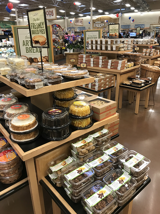
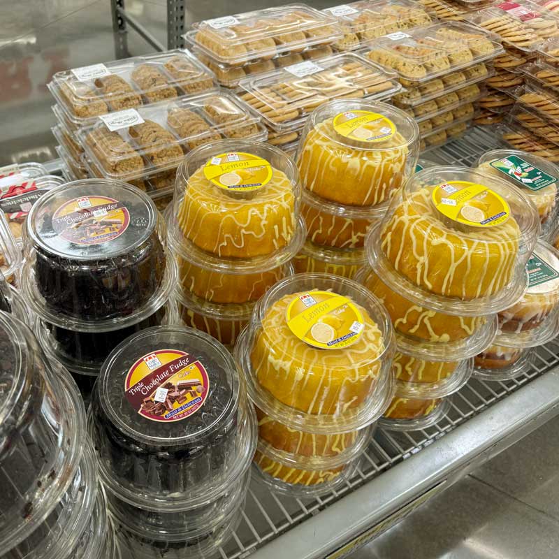
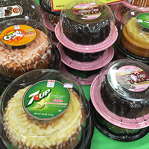
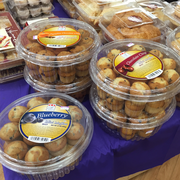
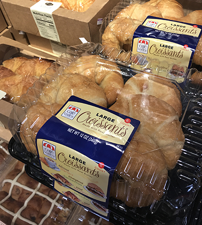
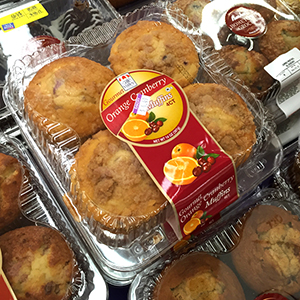
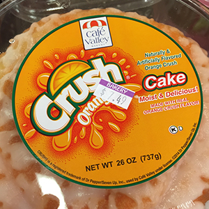
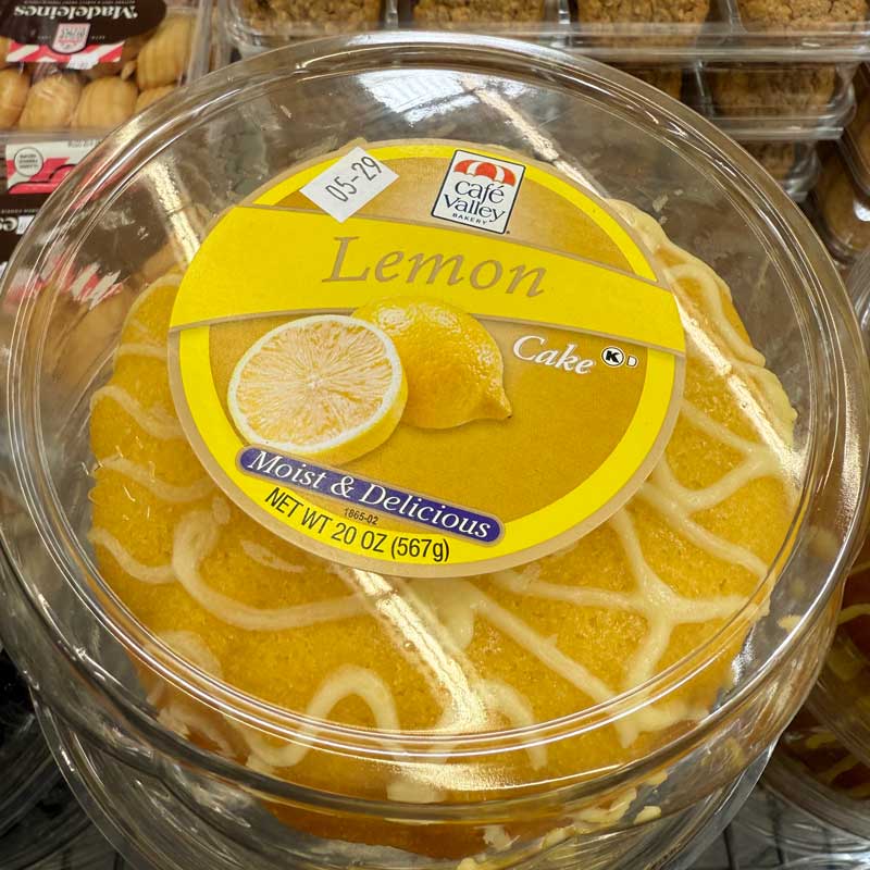
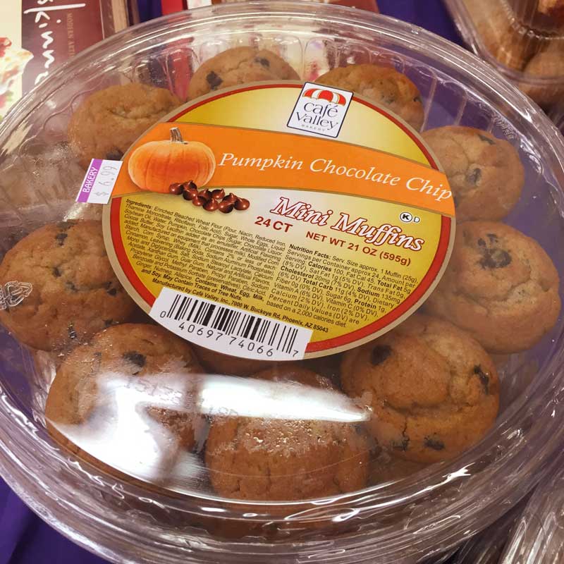
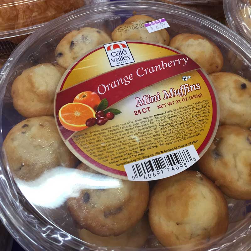
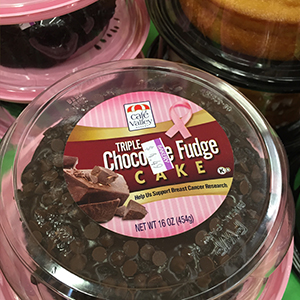
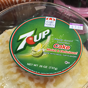
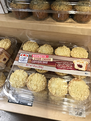
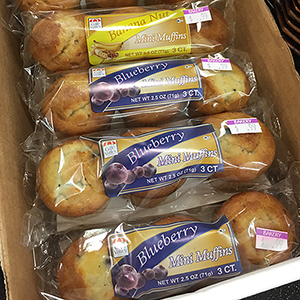
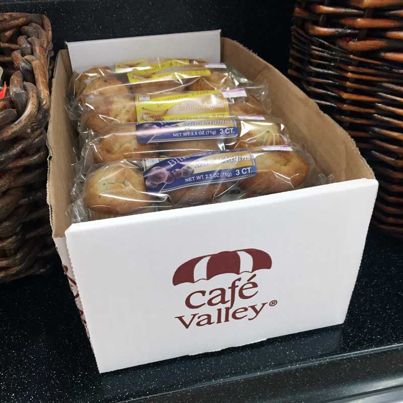
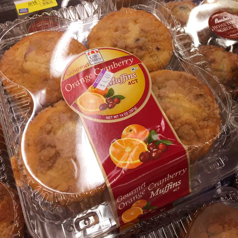
Typography, color systems, and packaging hierarchy were refined to improve readability and visual impact within competitive grocery environments.
- Kroger (approx. 1,251 U.S. locations)
- Costco (approx. 644 U.S. locations)
- Bashas’ (approx. 52U.S. locations)
- Ralphs’ (approx. 187 U.S. locations)
- Sprouts (approx. 491 U.S. locations)
- Safeway (approx. 912 U.S. locations)
- Fry’s (approx.131 U.S. locations)
This expansion required packaging flexibility, production consistency, and scalable brand standards capable of adapting across multiple retail environments.
The project demonstrated how strategic visual refinement can strengthen consumer recognition without abandoning established brand familiarity. By preserving recognizable old-world café influences while modernizing typography and retail presentation, the updated identity system helped Café Valley maintain authenticity while improving clarity, differentiation, and scalability within highly competitive grocery environments.
The refined Café Valley identity system strengthened shelf recognition and visual consistency across crowded retail environments by balancing traditional Italian café-inspired familiarity with modern typography and streamlined brand presentation. The updated visual direction helped improve consumer recognition, reinforce brand trust signals, and support expansion into major national and regional grocery retailers.
